Its finally time to load up some data and start having some fun! Now that we are familiar with Python, pandas and matplotlib we know that there are a set of basic commands that we can use to get through the first few steps.
We created a mind map to ensure we remember the first few steps and the associated techniques

Lets go through the steps in brief for a quick review. We will use a simple dataset from Kaggle which has information about Cereal data ( a simple google search for “Data sets for Machine learning” will give you many sites to download samples for Machine Learning but we really like Kaggle for its overview and submit your kernel for feedback )
1. Load:- Once you have downloaded the csv file put it in a home folder for your jupyter notebook and load it up to view the data types .This dataset has a csv file so we will use read_csv. You can use read_excel if you have to load an excel
localFile=os.path.join(‘cereal.csv’)
csvFile= pd.read_csv(localFile)
2. View:- Nothing as exciting as the first look at your data!
- head()
csvFile.head()
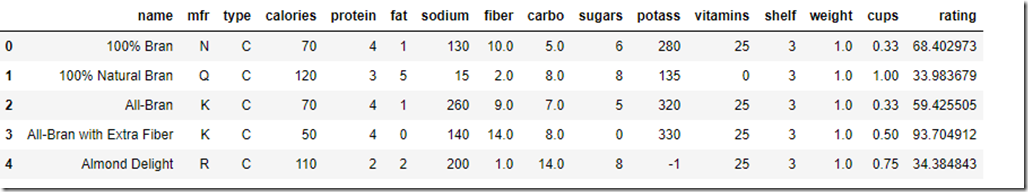
By default head() will show you the first 5 rows of your data. You can pass in a number to see as many rows. So head(10) will show you the first 10 rows in a nice formatted fashion
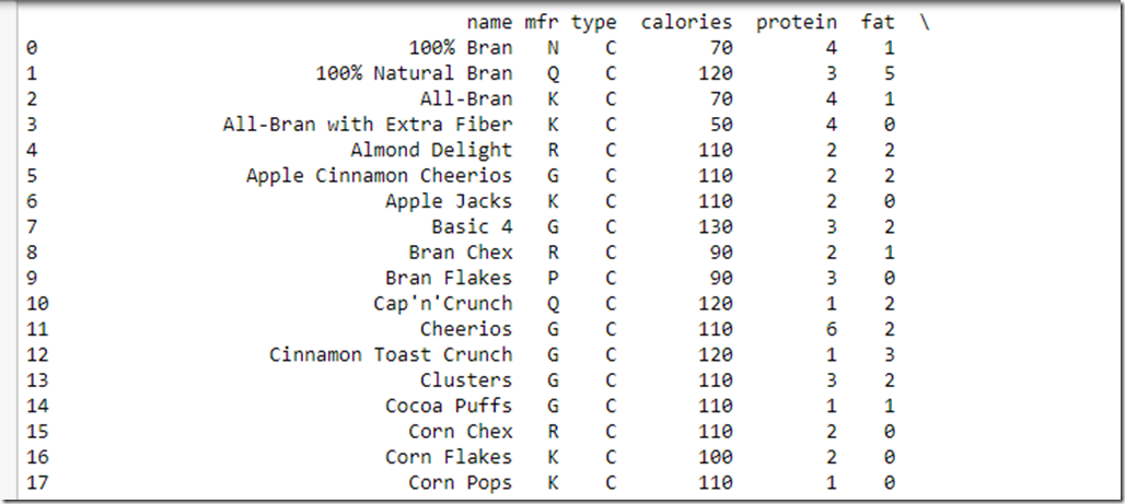
- print()
print(csvFile)
This results in a simple print of all data . Its not really formatted and you need to scroll to see the other columns.
3. Explore
a)info()
csvFile.info()
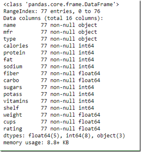
- Notice that Name, Mfr and Type are of type Object which can store any python object but since we loaded from a csv we know it will be a text value.As we proceed you will see that the typical visualization techniques will ignore these columns. We will need to convert these to numeric values if we want these to be part of our analysis.
- There are total 77 entries( it’s a VERY small dataset and frankly can’t be used for any ML experiment as such but good to load up and play around) and all the data columns are showing 77 values which means that there is no data missing in any column which is good news for further data processing
- All the columns are showing the values as non-null
b) value_counts()
csvFile[“mfr”].value_counts()
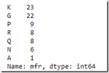
You can use value counts to understand how many “categories” for a field exist and how many entities fall in each of the categories. So there are 23 entries for manufacturer “K” and 1 for “A”
c)Describe():- This shows summary of numerical attributes
csvFile.describe()
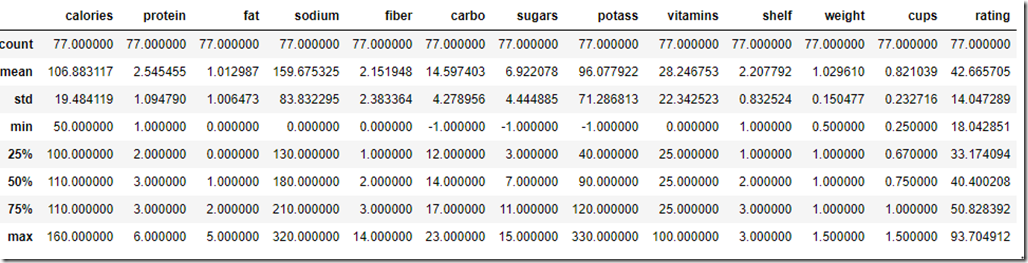
- std stands for standard deviation which shows dispersal of values
- 25%,50% and 75% are percentiles . For example 25% entities have rating less than 33, 50% less than 40 and 75% less than 50
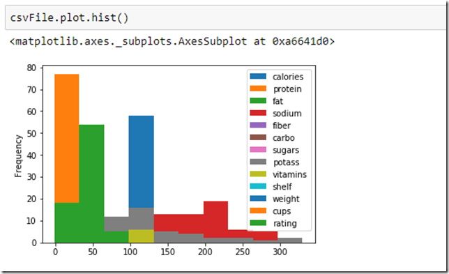
4. Visualize:- Data once loaded should be visualized via graphs to understand distribution, trend, relationship, comparison and composition about the data values
- Basic plots like Bar, Hist,box, density,area,scatter,pie etc using dataframe.plot(kind=“<type>”)or dataframe.plot.<kind>
- Plotting functions from Pandas.plotting like Scatter Matrix, Autocorrelation Plot etc
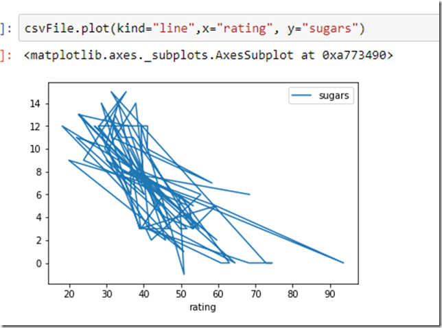
Here are a few examples of how we visualized our data
There are so many options here that this topic deserves multiple articles . The best consolidation we found at https://pandas.pydata.org/pandas-docs/stable/visualization.html
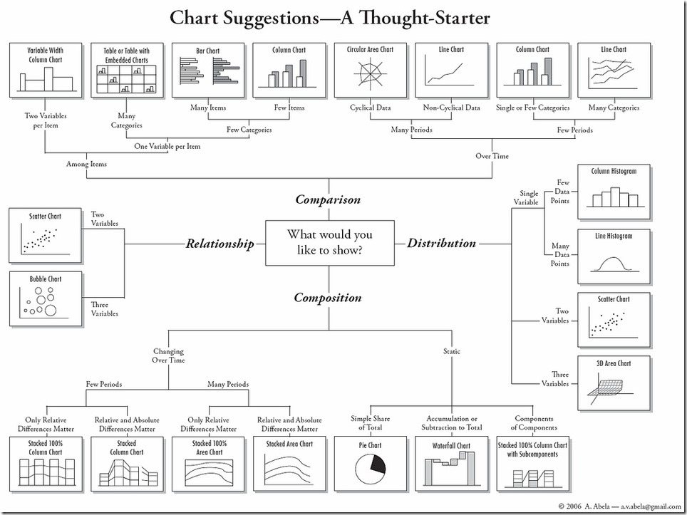
There are many forms of visualization and the correct one to choose would depend on the data types and their relationships with each other. The following blog is a great read for which type of technique to pick up depending on “type” of problem we are trying to solve
https://www.analyticsvidhya.com/blog/2015/05/data-visualization-resource/. The following cheat sheet posted on the above blog is worth reposting here ( originally from Harvard CS-109 extension program (online resource).
5. Correlate:- We can determine how varies attributes relate to one
a) Standard Correlation Coefficient :-The standard correlation coefficient measures the linear correlation between each set of attributes
correlation= csvFile.corr()
Now to understand how various components impact the rating of the cereal we need to check the correlation to rating
correlation[“rating”]
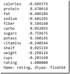
- Correlation coefficients range from –1 to 1.
- A value closer to 1 means there is a strong correlation. In the above example “Fiber” seems to be the only one with a good positive correlation to rating so we can assume as the fiber content increases there is higher chance of a better rating
- Value closer to –1 means a negative correlation so foods high in sugar will probably have lower rating
- Value close to Zero means there is no linear correlation.
b)Scatter_Matrix:– Another way to visualize the correlation between entities is to plot the scatter matrix which plots every numerical attribute against every other numerical attribute. You can parameterize it to just focus on the attributes you consider more relevant. Lets check of relation between sugar, calories and rating
from pandas.plotting import scatter_matrix
attributes=[“rating”,”sugars”,”calories”,”fiber”]
scatter_matrix(csvFile[attributes],figsize=(12,8))
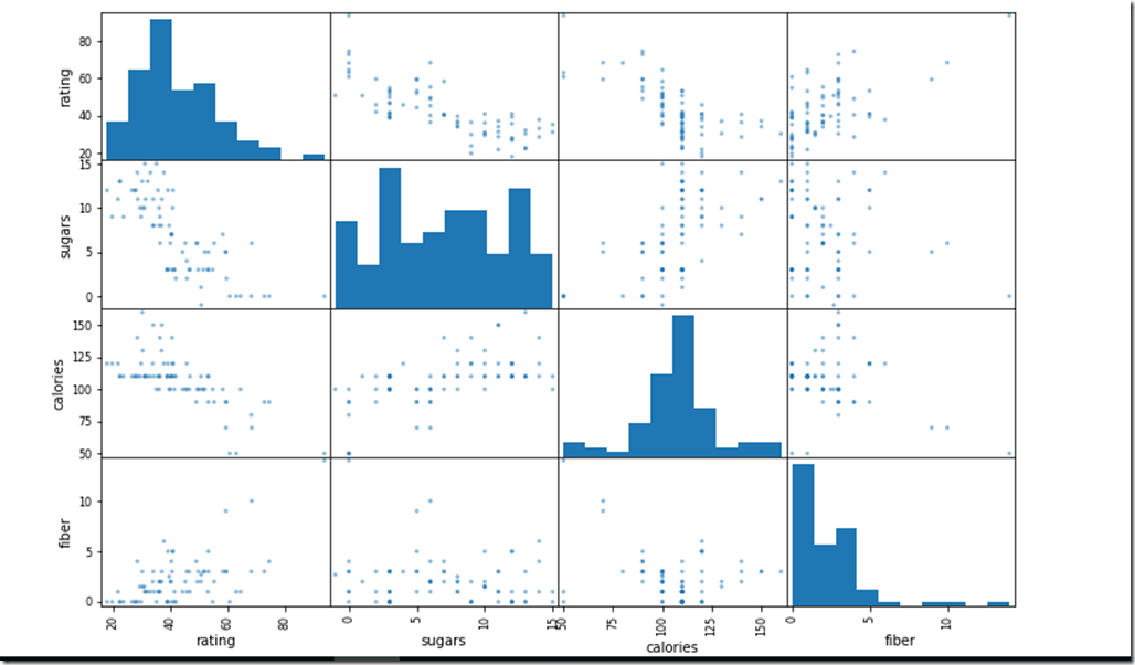
We can detect that as the Sugar and calories definitely have a downward slope with rating. Fiber on the other hand has a slight upward slope.Calories and Sugar surprisingly do not have a continues upward slope
We can further analyze relationship between any two attributes by just plotting their correlation
csvFile.plot.scatter(x=”sugars”,y=”calories”,alpha=0.5)
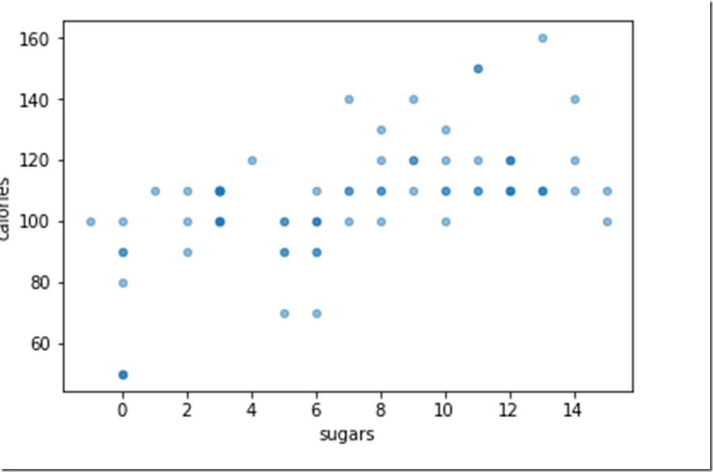
Shows that calories do not ALWAYS increase as sugar increases ( Good news!!)
6) Data Preparation:- Now that you have loaded up your data, sliced and diced it and looked at it from various angles you are itching to put it to work! However we need to still work on the data to “Prepare” it for usage. Data Preparation is a huge topic and may involve many steps based on the data. Few almost mandatory steps for data preparation are
- Test-Train Split
- One-hot encoding for categorical data
- Handle missing Data
- Dimensionality reduction
- Feature Scaling
Each of these are elaborate topics and we will tackle them separately in different blogs.
Until Next Time!
Team Cennest